
Who We Are
We Climb Trees, We Sing Loudly, We Dance Freely
Founded in 2013 with a dream to bring children closer to nature, Wee Wild Ones is a group of daycare centres that uses a child guided, inquiry-based approach, inspired by the Reggio Emilia style of learning. Our childcare and early childhood education programs promote exploration and learning through play, nature, and movement. At our centres and beyond, we support and uplift our community, champion diversity and inclusivity, and actively work towards greater environmental stewardship.
Our Beliefs
We genuinely love and care for children and see our work as more than just a job. We strive to make a difference in the lives of children and others by developing our future critical thinkers, problem solvers and leaders of tomorrow.
It is our mission to elevate, continuously innovate, and challenge the standard of high-quality childcare for the modern family. In doing so, our innovative culture values our youngest citizens, engages team members, partners with families, and strengthens our community to best serve and sustain the well-being of all.
Our Values
“Own it, Be Brave, and do it With Love”
Own It: We value personal ownership and accountability. We believe that everyone has the power to make a difference and is empowered to act. We understand that every decision and action has an impact, and we strive to be mindful of the consequences of our choices. We encourage a culture of continuous learning and development, recognizing that personal growth is a responsibility we each hold. Above all, we believe that actions speak louder than words.
Be Brave: We embrace the spirit of exploration and innovation, fearlessly venturing into new and unexplored ideas and valuing different perspectives. We take pride in tackling challenges that others may overlook, pushing the boundaries of what is expected of us. With a culture of openness, we welcome new ideas and celebrate the uniqueness of everyone, recognizing that our differences make us stronger and promote growth.
With Love: We approach every interaction with a loving heart, showing kindness, empathy, and compassion towards others. We believe that love has the power to create meaningful connections and foster a sense of belonging. Embracing a growth mindset, we recognize that mistakes are opportunities for learning and personal development, focusing on actions rather than passing judgment on individuals.
Our Approach to Learning
Method
Wee Wild Ones uses FLIGHT: Alberta’s Early Learning and Care Framework, which provides all teachers with the instructional guidelines necessary for developing age appropriate activities for children.
We offer an inquiry-based learning environment that is child-centred. Our curriculum emerges organically based on children’s questions and interests. Our programs are developed as educators actively listen and observe children in play; this naturally allows inquiry to be the focus of children’s learning. Observations inspire meaningful experiences, allowing children to explore their ideas and engage with others.
Environment
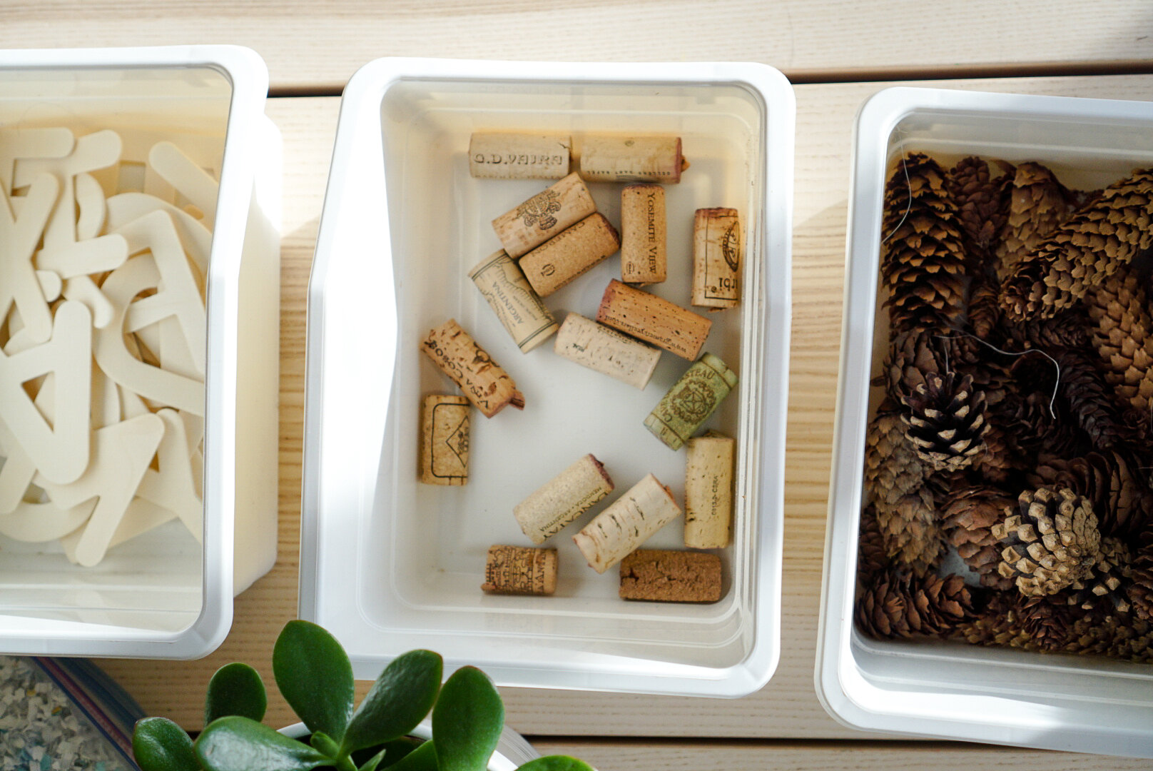
Our centres offer a balance of explorations in both indoor and outdoor environments. Nature becomes a venue for play and exploration in all seasons, strengthening the connection between children and their natural world. The environment is the third educator which helps spark children’s natural curiosity.
As leaders in the childcare industry, we cannot ignore our responsibility to the planet. We don’t settle for the status quo and are always seeking ways to reduce our impact and make our facilities more sustainable, all while sharing this knowledge with the children in our care. This includes, but is not limited to:
Vegetarian meals served in our facility
No single-use serveware or paper towels
Diligent sorting and recycling through Skip the Depot
Centre-wide cloth diapering program
Activities done with children and toys in the classroom have an emphasis on long-term use and natural materials
Nutrition
Healthy growth and development is rooted in a nutritious and balanced diet. The role we play in shaping children’s eating habits is directly tied to our commitment to intention and growth.
Our menu offers varying vegetarian food choices based on the Canada Food Guide requirements and standards with solely vegetarian alternatives.
Equity & Inclusivity
We believe that diversity of cultures and customs in our community offers opportunities for us all to learn and grow. We are committed to inclusion, welcoming, valuing, celebrating, and respecting individuals of all ethnicities, genders, ages, levels of ability, and religious backgrounds. We strive to increase our understanding of all communities, cultures, and backgrounds to make our centre a collective of stronger, more compassionate and effective future learners and leaders.
Community
As an organization, we strive to be active members of our community and give abundantly where we can. We are proud supporters of Big Brothers Big Sisters of Calgary & Area, a local non-profit that connects children and youth facing adversity with a caring and supportive mentor to enable them to become resilient and realize their full potential.
We host a variety of fundraising initiatives throughout the school year, including our annual Monster March.