Inclusion Starts with Us
Wee Wild Ones reviewed our brand, and we are excited to share we are making important inclusive changes to be leaders in the industry! As we lean on our values through this transition, we recognize our impact on the digital realm and in the classrooms.
This rebrand reevaluates our current brand and the importance of inclusive design through this, we had two goals; increase readability and promote accessibility.
Inclusive text and colours ensure everyone can eliminate barriers for individuals with disabilities or who speak different languages. For example, text that is too small or white can be challenging to read for people with visual impairments. Similarly, soft and low-contrast tones can make it challenging for individuals with colour blindness to distinguish between different elements on a page.
Typography
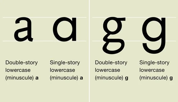
It was time for us to update our current fonts to promote accessibility and readability. Our past fonts were decorative and playful however, they contained letters that are difficult to read recognize and distinguish (ie the double-story g, short x-height, very similar character).
Our new fonts are clear, easy to read, available across different platforms, minimalistic and accessible.
Accessibility and inclusive design should not be an afterthought. We need to ensure the information we are producing is accessible, legible and easy to understand. The overall inclusivity of a font is not just determined by its design but also by how it is used.
Our Colours
According to the Canadian National Institute for the Blind (CNIB), approximately 1 in 12 men and 1 in 200 women in Canada are affected by colour blindness. This is a condition in which a person cannot perceive certain colours. There are three main types of colour blindness: red-green, blue-yellow, and total colour blindness. The most common type is red-green colour blindness (protanomaly, protanopia, deuteranomaly, deuteranopia). Blue-yellow and complete colour blindness are rarer (tritanomaly, tritanopia, cone monochromacy, achromatopsia).
When choosing colours, we reflected on the individuals consuming our content and asked ourselves, “How do we design something aesthetically appealing without sacrificing legibility.” We leaned on our value of Intention and sought out colours inspired by nature and versatile for our various needs... and in the end, it was easier than you think! Simply being mindful of the text size, colour and placement of elements; We can help eliminate barriers, promote equity and create a more inclusive environment.
Below is a list of resources for Inclusive Design
How Type Influences Readability
Introducing Accessibility in Typography
Good Fonts for Dyslexia
What Makes a Good Accessible Easy to Read Font
Typography in Inclusive Design Part 1: 8 key tips for Accessible Typography
Clear Print Accessibility Guidelines from CNIB
Inclusive Design: Colour Accessibility
Resource on Types of Colour Deficiencies
Colour Deficiency

